Quantcast
Channel: Lori McNee – Fine Art & Tips
Viewing all 273 articles
Browse latest View live

The Importance of Play

$
0
0

play, artists play

As artists and creative people, play is very important to our physical and mental health.

Here are 10 quotes by some famous people who understood the importance of play!

You’ve got to keep the child alive; you can’t create without it. ~Joni Mitchell 

Play is the highest form of research. ~Albert Einstein

The human urge to create comes from the play impulse. ~Carla Hannaford 

To stimulate creativity, one must develop the childlike inclination for play and the childlike desire for recognition. ~Albert Einstein

If you want creative workers, give them enough time to play. ~John Cleese 

The master of the art of living makes little distinction between his work and his play, his labor and his leisure, his mind and his body, his education and his recreation, his love and his religion. He hardly knows which is which; he simply pursues his vision of excellence in whatever he does, leaving others to decide whether he is working or playing. To him he is always doing both. ~Buddha

Almost all creativity involves purposeful play. ~Abraham Maslow 

It is a happy talent to know how to play. ~Ralph Waldo Emerson

We don’t stop playing because we grow old, we grow old because we stop playing. ~George Bernard 

What we really want to do is what we are really meant to do. When we do what we are meant to do, money comes to us, doors open for us, we feel useful, and the work we do feels like play to us. ~Julia Cameron

I hope this inspired you to get out, get up, get going, and play! What’s stopping you? ~Lori

Originally published on http://finearttips.com


Color Mixing: Don’t Always Stick to the Rules

$
0
0

color mixing rules

On color mixing, there are two rules I don’t agree with.

  1. Don’t mix more than three colors together at a time.

  2. Don’t use black in your painting.

Mixing “Mud”/Grays:

Muddy colors. We all hear about them, but what are they really? Do they look muddy because they’re gray. Or, are they just misused colors?

Some artists say if you mix more than three colors you will get mud. I’ve heard this many times and I disagree.

At the end of each painting session, I scoop my paint into a pile and save it for the next day when I need some grays. I will modify that paint to suite my needs. This is my “mud”. Mud will almost always have all the colors of my palette in it. That adds up to at least 7 colors –  many more than the three I’m not supposed to mix together!

In order to have paintings that glow, that have a vibrancy to them, I need my “mud”.

You’ve probably heard that grayed colors will make pure colors look brighter. Whatever it takes to get the right color of gray is the right thing to do. You don’t need a formula. You need to observe. Look at your pile of gray and ask yourself, does it need more red, green, blue, what does it need. What do I need to add to change the color, temperature or value. Add another color? Do it!

When someone says their painting looks “muddy”, it probably isn’t because some of the colors are gray. There may be other reasons. It may be because they have used the wrong color in a certain space, the temperature of the color may be off or they have worked two different values together when there should have been one value in a space.

color mixing rules

Brushwork can also make a difference in having a fresh look or a muddy look. When you muddle brushstrokes together, painting an area over and over instead of laying down nice clean strokes, the painting can look muddy.

“Mud” can look “fresh and clean” with strong, confident brushstrokes. Use enough paint on your canvas so that it doesn’t look weak and muddy.

Another common fault is to add too much white to a color. Titanium white, which is opaque can make a color chalky or in some cases “muddy”. Some colors just can’t be duplicated exactly as in nature, such as a pink in sunlight. Instead of adding to much white and getting that chalky look, you may have to make a choice to use a pink with a little yellow in it and use your deeper, richer pink in the shadows.

So, don’t limit yourself to the rule of no more than 3 colors mixed at a time.

Observe values, color, and changes in color temperature. Learn about the colors you use and how to mix any color that you want. Also, don’t overwork your paintings. Learn to lay down a color and leave it alone. If it isn’t right, scrape it off and try it again.

Using Black:

The other bit of advise I hear is to “never use black in your painting”. I think black like any other pigment has it’s place and use if it is used wisely. Now, I admit, I don’t use black often, but that doesn’t mean that it isn’t appropriate to use.
At times, I have used black to add to some of the dark colors on my palette. I modify the dark making it cool or warm, whatever is needed just as I would any other darks that I use. Black works very well with alizarine or viridian. I also have used black to gray colors, adding a very small amount of black to a color. It doesn’t take much. Black also makes a great warm green by mixing a yellow into it.

Now, a word of caution: I wouldn’t recommend black for the beginning artist. Black can be difficult to learn to use. When artists do use black, it is often overdone, a little bit goes a long way. I won’t say never use black by itself, but certainly don’t use it often or in excess in a painting.

Remember the rule, save your darkest dark (accent) and lightest light (highlight) for no more than ten percent of your painting.

It will be easier to break these “rules” once you have learned how to mix and use colors. Just don’t limit yourself by saying “never”.

Guest author/artist: Becky Joy is an artist, a painter, a teacher and an explorer who has achieved her lifelong dream of becoming a professional artist.

Originally published on http://finearttips.com

Art Buying Secrets from Top Interior Designers

$
0
0

Art Buying Secrets from Top Interior Designers

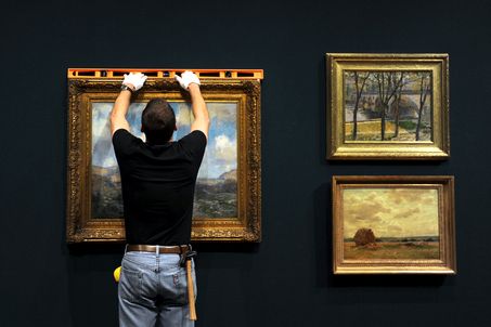
Interior designers are at the forefront of the hottest design trends and can keep you on the cutting edge of what is happening. This knowledge is an invaluable tool as you create new art, seek new sales avenues and grow your collector base.

Through social media I’ve met a lot of wonderful people, especially interior designers. They’re such a great group of people who truly love what they do for a living. As an artist, if you’re not connecting with this vibrant group of people, then you’re missing out. Designers are a witty bunch and they love to have a good time, both online and off! :-)

I reached out to some of today’s top interior designers and asked them for their art buying tips. I wanted to know where they look for new art and artists for their projects. So, without further ado, you’re about to meet some of my friends and quite possibly the nicest bunch of people you’ll ever see online.
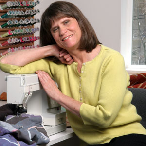

Lisa Mende

I love it when an artist sends me samples of their work or asks me to look at their website. I have found many artists this way. I don’t have a problem with buying art online as long as we have the understanding that it can be returned if it doesn’t meet the clients approval once in the room. I do like to use local artist when possible and also frequent local galleries. Hiddell Brooks in Charlotte is a favorite. I have bought art from Etsy, website and directly from the artist themself. Just this week I bought an original from Kerry Steele. She posted it on her Facebook page and within minutes I contacted her and purchased. When artists are featured on blogs and offer to giveaway a print or small painting, it usually results in multiple sales for that artist if the readers have a way to access an online store. I recommend artists have a strong online presence so that the artist isn’t just selling in one geographical area. If online you can sell anywhere.
Connect with Lisa: Website | Twitter | Facebook


Tyler Wisler

To be completely honest, finding a new artist to use within an interior is a tough road, but not an impossible one to trek. The key is to hit your ‘target’ designers… Art is so subjective, as you know, and what usually happens is your personal aesthetic may be fairly close to a designer’s, and that’s who you want to hit up! Social Media is out there for a reason… Use it! Start following fellow artists, and follow designers who you think are interesting or have a point of view that speaks to you, then… Reach out! It never hurts to put yourself out there to say hey! I found Todd McPhetridge through Twitter, and chatting a bit. I ended up using his amazing photography for a charity event I was a part of and will continue to keep him in my list of artists! I honestly have discovered a good dozen artists through these channels. It’s out there for a reason! Social Media may be killing us in so many ways, and assaulting our senses with horrible Instagrams of Kardashian’s in bikinis on the French Riviera, but it bridges geographical gaps and brings the creative community closer!
Connect with Tyler: Website | Twitter | Facebook


James Saavedra

Personally I gravitate towards abstract or photography because I think there exists greater opportunity to use those in a project – they seem more versatile in scope.

Tips would include pricing your work reasonably- don’t price yourself out of the budget for arts sake. I recently commissioned 9 abstract watercolors for a client. I offered the artist the budget I had to work with and he accepted. The client loves the pieces so much she wants to have his work in all the projects we have together.

Go large- one big piece is much better than a bunch of small ones so I look for pieces that have scale. 36 x 36 and up. If photography Iíll use smaller pieces — it can be more intimate- but right now I’m looking for a giant piece of photography.
Connect with James: Website | Twitter | Facebook


Traci Zeller

Galleries are a wonderful place for more established artists, and my favorite Charlotte gallery is Hidell Brooks. In Charlotte, we are also fortunate enough to have several design shops that host multiple vendors and artists. Those shops are my favorite places to search for emerging local talent and a great resource for reasonably priced pieces.

I prefer more modern, abstract art … but that is nothing more than a personal preference! My suggestion would be for artists to look to new fabric introductions for color inspiration, so that – no matter what the genre – the work will coordinate with today’s interiors. I don’t believe in “matching” your art to your interiors, but they should complement each other!

Large pieces, and particularly those that are reasonably priced, are the most difficult to source. By large, I mean 36″ x 48″ and up. I love art and I absolutely want artists to be paid what they are worth, but the price point of a large piece can be a hurdle for some clients, especially if the artist is new or not particularly well-known. In lieu of large pieces, I also love when artists create pieces that work together so that I can use a grouping for a greater impact.
Connect with Traci: Website | Twitter | Facebook


Courtney Price

Art is such a personal thing, I certainly don’t have any “one size fits all” advice to offer on this topic. I am noticing that contemporary art with bright pops of color seems to be popular at the moment. My advice might be a little surprising- a reminder to the client/designer to be respectful to the artist.
Connect with Courtney: Website | Twitter | Facebook


Andie Day

I work with my clients to pare down possessions that have become handcuffs to a life that no longer serves them well. Living untethered by things results in a dynamic lightness; the freedom brought on by the minimalistic approach inspires thoughtful design and promotes an authentic life that is fully optimized. With the stripping away of the superfluous, the core essentials fade into the background, allowing art to become the true expression of my client’s personality. That’s the quintessential sweet spot for the artist. Share with me your raw, uncut and unedited versions of your greatest work. Tell me your story. What role does the color palette have on this canvas? Why this piece? There’s a strong chance Iíve got a client that has felt the same emotion. And hot damn, FB, Instagram, Pinterest & Twitter have been designed with you in mind. Artists, welcome to the new age! Jump into social media if you havenít already. This is YOUR time – embrace it. Learn to love social media or bring someone in that will do this for you. As you begin to develop your contact relations management system (CRM), be sure to select designers whose work is compatible with your own. Use your intuition and skill set when assessing potential ambassadors/partners. View portfolios and determine whether your art would work well in those environments. Be targeted, be focused, and be innovative.

I’ve included a link to Mashable’s Artist’s Toolbox: 30+ Places to Promote Your Art
Connect with Andie: Website | Twitter | Facebook


Sarah Sarna

I always tell my clients, “A painting and a photo of a painting are two very different things.” Make an appointment with the gallery and learn about the artist and their story from their representative, or from the artist themselves. Always always see the piece in person.
Connect with Sarah: Website | Twitter | Facebook


Patrick J Hamilton

If an artist wants to start making inroads with designers, it’s about the right fit, and making things easy. Familiarize yourself with a designer’s work… are they bold with modern art? Do they typically work with a more subdued palette? Do they usually feature color photography? Understanding a designer’s work will help make a better connection. (It’s also flattering to a designer if you know something about their work!)

It ís also about ease… I know artists who will make art available on loan, so a designer can present a piece to a client in the actual context. Itís a great tool, and greatly increases the odds of a sale. Artists also have to have shareable images of their pieces ready to roll, so an image can be worked into a designerís client pitch.

But if you canít bring the art to the designer, bring the designer to the art! Nothing beats a personal meeting, a studio tour, a personal connection. I’m far more apt to consider and remember an artist Iíve met, at a gallery, art show (I’m a huge fan of NYC’s annual AAF/Affordabel Art Fair), their own studio, or at an opening.

And get out to the design to-the-trade buildings. Make your work known to furnishing showrooms who might consider showcasing your work in a residential-type environment. It helps clients picture the work in a home easier than seeing it in a pristine white gallery might.

I’d also suggest building a relationship with a good quality framer. I’ve been introduced to several amazing artists though my framer, Steven Amedee Custom Framing, down in Tribeca.

Designers typically work in a world of custom opportunities… so we often look for specially-commissioned pieces… a specific size, proportion and color. That might seem a little sacrosanct to a fine artist (art on demand!), but itís a necessary measure of practicality. Plus, so many clients want custom, something original. How glorious to be able to say, This was painted for me?

No surprise, I’m a fan of social media to open doors. I’ve found many new (to me!) artists who have their own Facebook pages.

As far as what’s catching my eyes these days, I love non-rectilinear artwork now, specifically circular images, like Nicholas Guerreroís ìOrbitales.î I love how a circular canvas (or in his case, plexi mount) can activate an otherwise straight-lined architectural space. And no coincidence, I found him because he Friended me on Facebook!

And I’ve always been a fan of contemporary art in otherwise traditional spaces. It shakes the dust right off of traditional.

For the record, too, I don’t consider decorative a dirty word when it comes to even fine art. But then again, I’ve never taken issue with being called a decorator!
Connect with Patrick: Website | Twitter | Facebook


Final Thoughts

I’ve met most of my interior designer friends on Twitter and then connected with them on Facebook, Google+, LinkedIn, Pinterest, Instagram, Klout and Vine. Some are more active on one channel than another, so it’s a good idea to have an account on each of the big social media platforms.

Hopefully this has the wheels turning in your mind and has given you some insight into today’s art buying process. I’d like to thank all of the fabulous interior designers for their contribution and if you have a second, be sure to say hey, follow them on Twitter and like their Facebook page.

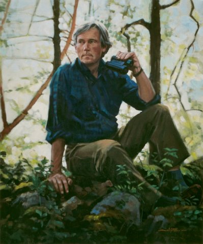
Guest artist/author Todd McPhetridge is a Fine Art Landscape Photographer signed by Winn Devon. He also owns Rustic Ventures, a rustic home furnishings business. Connect with him on Twitter and Facebook. He is a marketing ninja with an eclectic taste for all kinds of music. His chili is epic and he has a keen wit about him. Head to Atlanta and drive 40 minutes North and you’re bound to cross paths with him hiking in the mountains with his son.

Originally published on http://finearttips.com

Setting Up A Small Encaustic Wax Studio

$
0
0

Lately, I have been experimenting with encaustic wax painting.

For those of you who don’t know, encaustic painting is an ancient art form of ‘hot wax painting’ that dates back thousands of years. In Greek, the term “encaustic” means to “burn in” and is used to describe both the paint itself, and the method for using it.

But because of this ‘burning in’ technique, special studio precautions must be taken to ensure the artist’s safety. Proper ventilation is most important because as the encaustic wax medium heats up to its working temperature, it creates noxious fumes.

Recently, I set up my own encaustic corner within my small studio space. With a little advice from R & F Paints, here’s how I did it…

encaustic wax painting tips

I don’t have a lot of extra studio space, but my old drawing table fit perfectly in this corner.

Then, my electrician was able to easily vent the range-hood from the inside wall to the outside of the studio. We tested for airflow by simply lighting a stick of incense and watched the smoke rise into the range-hood. Honestly I wish the hood was a little bit lower, but I had some restrictions that wouldn’t allow for it. While working with the wax, I also make sure to keep a window cracked open for replacing fresh air.

Here’s what I bought to get me started:

  • The range-hood is by Allure from Home Depot.
  • I also bought an inexpensive heat gun and blow torch for fusing from Home Depot.
  • The handy Hamilton Beach electric griddle with a temperature control is for melting the wax medium and pigments.
    • I keep my wax at about 180 – 200 degrees. I want the wax hot enough to flow easily from my brush to the painting, but not so hot that it smokes. 
    • According to R & F Paints, at a higher temperature (around 200-220°F), which is the working temperature of encaustic, it is important to have ventilation.
    • The fumes can be irritants, causing headaches, nausea, and respiratory problems. I use a flat thermometer to monitor the heat.
  • Wax medium and pigments.
  • Metal tins for melting wax.
  • Natural bristle brushes (synthetics will melt) are affordable and available at hardware stores or art supply stores.

In the photo below, you can see that I later added a galvanized oil drip pan that I found in an auto parts store. The drip pan helps make my work surface more heat resistant and fire retardant.

encaustic painting

I am fascinated with the luminous, organic quality of encaustic wax.  The wax has a mind of its own, yet it can be fused or re-melted to create a variety of lustrous effects.

Encaustic wax goes from a liquid to solid state and back again in seconds, which allows layers to be built up immediately, without any drying time. Once cooled, the painting can be revised and reworked with heat at any time – minutes or years later.

Encaustic wax painting offers something for everyone, whether you enjoy drawing, painting, photography, printmaking or even sculpture!

To learn more about venting your studio for encaustic  >  http://www.rfpaints.com/images/stories/pdfs/tech_enc_venting_studio.pdf

For encaustic supplies please visit these fine retailers:

You can see my art on my website,  LoriMcNee.com, and let’s meet on Facebook  Fine Art Tips Facebook Fan Page, on Twitter, Google Plus and on PinterestBe sure and check out and my fine art prints and notecards on Fine Art America.! ~Lori

Originally published on http://finearttips.com

Glazing Tips For Solvent Free Oil Painting

$
0
0

For over 10 years, I have been enjoying the benefits of solvent free oil painting.

I often get asked technical questions on how to use these solvent free oils – also known as ‘water mixable’ or ‘water soluble’ oil paints. Recently, I received a question on my Fine Art Tips Facebook Page about glazing tips. In this video below, Cobra demonstrates how to properly use their glazing medium. I hope it helps! 

For those of you who have tried oil painting, I think you will find water soluble oils less intimidating to use than traditional oils. They deliver beautiful results, and once dry should be treated just like any other traditional oil painting. Plus in using them, I enjoy the fact that I am becoming an eco friendly artist!

I have written a helpful post about water soluble oils to help answer your questions. Water Soluble Oils: Facts, Tips & Why I Use Them. 

After testing the different brands, I believe Cobra Water Mixable Oil Color by Royal Talens offers the highest quality and variety of pigments, and they have developed some helpful mediums to enhance your oil paintings.

PS. You can view my oil paintings on my website, LoriMcNee.com and on Fine Art America. Also let’s meet on  Twitterand on Google Plus, Pinterestand join in the fun at Fine Art Tips Facebook Fan Page! ~Lori

Originally published on http://finearttips.com

Art Is A Trip!

$
0
0

Whether a painter, a dancer, musician or writer, all artists who regularly practice their craft understand the transformative magic of Art.

Art is a trip and allows our imaginations to escape without leaving home. Art transcends language and barriers without the need of a passport!

American dancer and choreographer, Twyla Tharp said it best in the quote below. I shared her quote along with the beautiful painting by Abbott Handerson Thayer (American 1849 – 1921) on my Fine Art Tips Page. It was popular, so I thought I’d share it with my blog readers too.

Abbott Handerson Thayer art quote

You can see my art on my website,  LoriMcNee.com, and let’s meet on Facebook  Fine Art Tips Facebook Fan Page, on Twitter, Google Plus and on PinterestBe sure and check out and my fine art prints and notecards on Fine Art America.! ~Lori

Originally published on http://finearttips.com

Tips For Drawing Realistic Pet Portraits

$
0
0

Knowledge of animal anatomy is the key to drawing realistic pet portraits. It is what makes a drawing come alive, as opposed to being just a likeness.

As a former zookeeper and veterinary technician, I am fortunate to have come face-to-face with many different animals – wild, exotic and domestic. Seeing them up close, and getting to touch and hold them, has served to be an invaluable reference for my pet portraits. Here are a few considerations I use to create realistic pet portraits:

1) Eyes – the eyes are the soul of the portrait, so if they’re not right the whole portrait suffers. Cat eyes are especially challenging because of the subtleties of color and depth in the iris. I use colorless blenders and paper stumps, with varying pressure, for subtle shading differences. Also, contrasting the dark shadows from the upper eyelid with the bright glint off the cornea helps give the eye its shape.

Tips To Drawing Realistic Pet Portraits

2) Coat – There are so many characteristics to consider when drawing animal fur: color, markings, pattern, texture, length. Again, a good working knowledge of the nature of fur is helpful in creating a realistic drawing. Some animals have an undercoat of short, soft fur beneath a top layer of longer, coarser hairs. I use harder pencil leads (in the “H” range) first, because they give a lighter and finer appearance. Top hairs are often thicker and darker, so I use softer leads (in the “B” range) last.

Tips to drawing realistic pet portraits


3) Nose – Dog noses can be particularly tricky to draw: they are soft, rubbery, often wet and have intricate folds and textures. It may be unconventional, but I often pencil in the darkest areas first (the nares), being careful to leave the paper white where the light reflects the brightest. I use a kneaded eraser, or an electric one, to create the bumpy texture of the nose-pad.

pet portraits, dog, drawing, As an animal artist, you will benefit tremendously from getting to know your subject firsthand. And with practice and persistence, the animals you draw will look like they might walk off the page!

Guest artist/author Scott Schiller is a pet portrait artist with over 20 years’ experience. You can visit his website to view his work: www.thepetsketcher.com

Originally published on http://finearttips.com

Advice For The Aspiring Artist From Andy Warhol


How to Steal A Van Gogh Idea For Your Own Portrait Painting

$
0
0

When it comes to color, we can certainly learn, or even better, steal from the masters. My all time favorite artist is Vincent Van Gogh, who is my inspiration, mentor, and I dare tell you, my dream-lover!

Here is how I used the great artist’s idea in two of my own paintings, one a self portrait and the other a portrait of my 1-year-old daughter.

The Inspiration

Portrait of Eugène Boch

“Portrait of Eugène Boch” may not be the most famous Van Gogh but it is one of my favorite. This is what Vincent said in his letter to Theo about his idea for the painting,

“I should like to paint the portrait of an artist friend who dreams great dreams, who works as the nightingale sings, because it is his nature. This man will be fair-haired. I should like to put my appreciation, the love I have for him, into the picture. So I will paint him as he is, as faithfully as I can – to begin with. But that is not the end of the picture. To finish it, I shall be an obstinate colourist. I shall exaggerate the fairness of the hair, arrive at tones of orange, chrome, pale yellow. Behind the head – instead of painting the ordinary wall of the shabby apartment, I shall paint infinity, I shall do a simple background of the richest, most intense blue that I can contrive, and by this simple combination, the shining fair head against this rich blue background, I shall obtain a mysterious effect, like a star in the deep blue sky.”

Although he didn’t paint himself, I believed this portrait was every bit as Eugène Boch as Vincent Van Gogh. And I was inspired to paint another “Artist Who Dreams Great Dreams”.

My Self Portrait

How to Steal A Van Gogh Idea For Your Own Portrait Painting

The master’s reference could certainly help to make the painting process easy and smooth. However, it is important to observe how Van Gogh applied the colors, especially how he handled the colors in the shadow areas.

My Palette:

1. Titanium White
2. Chrome Yellow Hue
3. Burnt Sienna
4. Cadmium Orange, and
5. Cobalt Blue.

Shadow areas:

Blues, greens and oranges of varying intensity and value are used for the shadow areas of the portrait. To make these colors, I mixed:

1. Cobalt Blue with Cadmium Orange
2. Cobalt Blue with Chrome Yellow
3. Burnt Sienna with Cadmium Orange

Light Areas:

The light areas aren’t as colorful as the shadows. I simply used a mixture of Chrome Yellow with Titanium White for the light areas. For the orange cheeks, I added some Cadmium Orange to the mix.

Painting Process:

I think Van Gogh might have painted this alla prima, as with most of his other paintings. So working wet-on-wet, I also painted mine in one session:

1. Firstly I made a pencil sketch of my head on the canvas by looking in the mirror.
2. I then painted the night sky background with a mix of Cobalt Blue and some Cadmium Orange.
3. Observing how the light fell on my own face, I applied colour to the canvas following my findings of Van Gogh’s use of colours. Working from dark to light, I mixed colours as I progressed, but pre-mixing the colours would also be a good idea.
4. I worked on the whole portrait at one time, applying similar colours to different areas, and used a dry blending brush to mix the wet paint and smooth the edges.
5. Hair, cloth and the stars were painted last.

The portrait and the painting process itself made me happy. Because with it, I was brave enough to admit to myself and also tell the world that I am an “artist who dreams great dreams”.

Portrait of Chloe

How to Steal A Van Gogh Idea For Your Own Portrait Painting

If the self portrait was more of a “copy” than a “steal”, then my portrait of Chloe was certainly much more creative. Having already experimented with this palette, I was free to let my imagination take the driving seat.

I followed the same process, used the same palette with the addition of Ivory Black, and completed the painting in 3-4 hours. Two things to note are:

1. I worked from a photo of Chloe, because it would be inane to ask a 1-year-old to sit still. I used photo references for all of my children’s portraits.
2. I used Ivory Black in Chloe’s eyes, the hat, and to paint the flying witch.

Both my husband and Chloe herself said that I was the flying witch when they saw the painting. This certainly wasn’t my initial intention, but it seemed to have turn out as such.

So here is how I interpreted the master’s painting, especially his use of color, to paint two portraits of my own. It is only my way, and it certainly isn’t the only way or the “right” way to do it. Hopefully, this article has inspired some of you to study Van Gogh in more depth, or to experiment with his use of colors. And perhaps you would like to share your tips and insights, too.

Guest artist/author: Lucy Chen is a portrait artist based in Sydney, Australia. She likes to experiment with colors and symbols in her works to express feelings and tell stories. To find out more about her and her works, visit www.LucyChenFineArt.com

****

Thank you Lucy for sharing your inspiration and for teaching us how to put a modern day twist on an old master’s work!

Thanks for visiting FineArtTips.com. You can see my art on my website,  LoriMcNee.com, and let’s meet on Facebook  Fine Art Tips Facebook Fan Page, on Twitter, Google Plus and on PinterestBe sure and check out and my fine art prints and notecards on Fine Art America.! ~Lori

Originally published on http://finearttips.com

How To Take Photos Of Your Artwork Like A Pro

$
0
0

photography, artwork, how to, photos

Once you have finished your artwork, the next logical step is to create a digital copy that you can store in your computer. This is done so you can share your work online with other artists for comments or print it out to be included in your portfolio.

One way of creating a digital copy of your artwork is to take a picture of it using a camera. However, if you want the best copy to be uploaded to your computer, there’s more to taking a picture than just pointing and clicking your camera to the artwork.

Below are tips that you must consider to fully understand how to take professional pictures of your fine art.

Camera set-up

To get the best results for your artworks, use digital SLR camera with high megapixels to have greater depth and detail in your photos.

If you’re not adept with using a camera, the auto-focus feature should be fine. However, it is advisable that you manual set up your camera to get crisper lines in your photos. Adjust the aperture or f-stop, which refer s to the set of blades inside your camera that allows light to enter and process the photo, accordingly. The higher the aperture, the more light and less depth (making the surroundings out of focus) the image will have. Conversely, the image will have less light and greater depth if you lower your aperture.

The ISO or image sensor sensitivity should be set to its lowest, which is 100, to achieve a sharper image.

It is ideal to use a camera stand when taking images and setting a two-second timer delay after pressing the button. This gives you time to remove your hand from the camera and keep it stable to take the shot.

Lighting and Positioning

You can choose between setting up your artworks to be shot under natural sunlight or professional lighting.

With natural light, you will have to worry about the glare that will reflect from the artwork once you’re shooting it. Find a shade or shoot the artwork against a dark background to neutralize the glare. Conversely, for dark artworks, shoot it against a light-colored background. You may also adjust the white balance or linear polarizing filter in your camera to dial down the intensity of the sunlight and strip the glare from the photo. Try to shoot at different locations with varying amount of sunlight to get even lighting to your artwork.

If the weather is cloudy, you may choose to use professional lighting to take pictures of your artwork. Keep in mind that this may cost you money since you will ideally need two light sources with high wattage. The two light sources must be set up opposite each other, both preferably at a 45 degree angle and four meters away from the art. This type of lighting is ideal for painting so you can reveal the texture of your work in greater detail. You can achieve this by just using one light source.

Your artwork should not appear tilted and that its edges must be parallel with the view finder or perspective control. You are advised to zoom your camera to above 50mm because anything below that figure may distort the edges and corners of your artwork. Leave as little space around the art as possible; you can edit out the extra space using a graphics editing software later.

Since you are using external lighting to take your photo, turn off the flash from your camera.

Additional tips

  • Take as many pictures of your artwork as possible using the same camera settings, position, and lighting. This way, you will have different images to choose from.
  • After taking pictures, proceed with doing the necessary edits using your computer. Do not pack up your stuff yet as you may spot mistakes in your computer and will have to redo the shoot.
  • As much as possible, do not make drastic changes to your photos using your graphics editing software. If you are forced to edit something from the image, do it directly from the camera using its different functions.

For more tips on how to take professional pictures of your artwork, check out Lori’s two-parter about this topic – How to Photograph Your Artwork the Easy Way! Part 1 and How to Photograph Your Artwork the Easy Way! Part 2.

Guest author: Karen Kesteloot is a Canadian art instructor for more than 15 years and has taught in different art programs at Sheridan College. As the owner  of PortPrep, she has made an effort to help high school students make a winning art portfolio that will get them to the best art and design programs.

*****

Thanks for visiting FineArtTips.com. You can see my art on my website,  LoriMcNee.com, and let’s meet on Facebook  Fine Art Tips Facebook Fan Page, on Twitter, Google Plus and on PinterestBe sure and check out and my fine art prints and notecards on Fine Art America.! ~Lori

Originally published on http://finearttips.com

Branding Tips For Artists with @LoriMcNeeArtist and @LoriMoreno

$
0
0

Brand Building Tips For Artists with @LoriMcNeeArtist and @LoriMoreno

Recently, I had a great time tweeting the Emmys in Studio City at CBS in the OMG Insider studio. After our ‘tweetup’ Lori Moreno, aka @LoriMoreno on Twitter,  interviewed me for her blog. She asked me to share some of my branding tips for artists.

As many of you know, I love Twitter and social media in general. Over the past 5 years, social media has enhanced my art career and literally changed my life. In fact, that’s why I was asked to tweet the Emmys!

I hope you enjoy this quick, informative video that was filmed by our fellow Twitter friend, Sebastian St. George aka @YogaArmy on the set of OMG Insider.

Let me know what you think!

Thanks for visiting FineArtTips.com. You can see my art on my website,  LoriMcNee.com, and let’s meet on Facebook  Fine Art Tips Facebook Fan Page, on Twitter, Google Plus and on PinterestBe sure and check out and my fine art prints and notecards on Fine Art America.! ~Lori

Originally published on http://finearttips.com

Handy Artist Palettes by New Wave

$
0
0

My friends at New Wave Fine Art Products, makers of handcrafted artist palettes, have sent me new products to review. Two different shapes of the Grey Pad disposable palettes, and the handy Easy Lift peelable palette.

Handy Artist Palettes by New Wave

Lori holding the Grey Pad handheld model.

Last year, I tested out the New Wave Highland plein air, and Grand View Confidant studio palettes. I am still so impressed with these beautiful, functional palettes and I use them all the time. You can read my review here > Enjoying My Artist Palette by New Wave.

As an art blogger, I am often asked to sample art related products from many companies. I have to say, New Wave Fine Art Products truly live up to their name…their products are fine for sure.

The newest products are the Grey Pads and the Easy Lift peelable palettes. These products were created with the busy artist in mind.

Grey Pads

I was happy to discover that the Grey Pads are not your ordinary disposable paper palettes. These grey colored palettes are designed to enhance color and value gauging while painting! In other words, the grey paper color makes mixing and comparing color and values simple –  plus the grey is easy on the eyes while under bright studio lights or while plein air painting in the sunlight.

The disposable palettes are available in two handy designs.

  1. The Grey Pad rectangular model. This shape is perfect for tabletop mixing.
  2. The Grey Pad handheld model. I really enjoy holding this palette in my hand for easy mixing, value and color comparison while next to my painting. The ergonomically friendly handheld palette has a patent pending design that provides the artist with balance and comfort in the hand.  

Handy Artist Palettes by New Wave

Both of these disposable paper palettes have a generous 11×16 inch mixing area and contain 50 neutral grey sheets of durable paper stock with a special coating to make certain the sheets beneath stay dry. The paper pads really held up to the task when I used my squirt-bottle of water to keep my acrylic and water soluble oil paints fresh!

In addition, the Grey Pads are glued on 3 edges, ensuring that your pages stay fastened while you mix paint. It also ensures your pages do not blow in the wind if painting outdoors! 

But that’s not all!

There is another clever palette added to the New Wave product line. The Easy Lift peelable palette…

Easy Lift

Easy to hold and easy to clean this ‘peelable’ artist palette is ideal for acrylic paints and versatile enough for oils (cleaned with solvents).

That’s right, dried acrylic paints simply peel away! As you can see from the photo below, I tested it out. I was pleasantly surprised at just how easy the 2 day old dried acrylic paint lifted off of the palette! With just a flick of my palette knife, the dried paint was easy to lift! The Easy Lift palette lives up to its name! Plus, the dried acrylic paint is much easier to clean off from the Easy Lift than from my glass-topped palette.

Handy Artist Palettes by New Wave

The Easy Lift also has a patent pending 3-point ergonomic design that evenly distributes the weight among your hand, arm, and torso. To add more comfort, the Easy Lift comes with a flexible silicone thumb ring that is interchangeable for right and left handed painters. At 11″x16″ this palette is easily transportable and extremely lightweight.

If you are looking to minimize your studio mess, clean-up time, or just want to travel lightly, I highly recommend giving the disposable Grey Pad palettes or Easy Lift palette a try. While visiting New Wave Fine Art Products, please be sure to view their beautiful wooden palettes too.  All these products are proudly made in the USA. Please tell them Lori from Fine Art Tips sent ya!

For all you artists from ‘across the pond’, you can find the New Wave palettes exclusively through Rosemary Brushes. Please tell them Lori sent you!

*Thanks for visiting FineArtTips.com. You can see my art on my website,  LoriMcNee.com, and let’s meet on Facebook  Fine Art Tips Facebook Fan Page, on Twitter, Google Plus and on PinterestBe sure and check out and my fine art prints and notecards on Fine Art America.! ~Lori


Originally published on http://finearttips.com

5 Reasons Why Social Media can Help Boost Your SEO and Increase Traffic

$
0
0

5 Reasons Why Social Media can Help Boost Your SEO and Increase Traffic

Social media has been being used by successful people since it first came out. The thought of having so many people using these sites can be intimidating, but really social media can make your website thrive.

Even if you only attract a very tiny fraction of the people within social media sites, your site will be successful. So to help you realize why you should be getting yourself into social media as soon as possible, here are 5 reasons.

Quality Content

To be a successful website nowadays, it is a requirement to post quality content. Whether it is on a blog, or just to keep your customers informed about products and services. Either way, that content is then indexed to search engines and you are ranked accordingly. Social media can really help you in this aspect because if your content gets a lot of attention, the rank of that page is going to sky rocket. You will be able to link your content directly to your audience and then they will take a look. Depending on how well the content was made, those people might end up sharing it with their friends and family. So now, not only have you helped your content get more traffic and higher rankings, you provided value to your social media followers. It is a win on all aspects.

Followers

As you probably already know, social media lets people follow you to ensure they don’t miss anything that you post. If you have your profile linked directly to your website, and then attract a large amount of followers, they will eventually start going to your website to get more information about what it is you offer. If you are just starting on social media, don’t expect thousands of followers right off the bat, you have to work for them. If you provide them quality content or some type of value, then over time you will see more and more people start liking your content and following your profile.

Sharing Features

This is going to be where you will get the most attention and the most traffic. I’m sure you have heard of something “going viral” . Viral basically just means that a piece of content was posted normally and then shared on a social media outlet. Then after just a little while, more and more people continued to share it, until it has millions and millions of views. While you might not have as much success right away, the point is that once you post quality stuff to social media, the possibilities are endless. You may end up with a multimillion views piece of content, and a fraction of those views will go to your site, helping your overall traffic and SEO efforts.

Follower Interactions

Another great aspect of social media, is that it lets you communicate with your followers without any problems. You can publicly post to them, private message them, send them images, videos, and other media. By interacting with them, you are giving them a connection with your profile and a reason to come back. The more responses you provide your audience, the more they will trust you and your website. Don’t be afraid to talk to people, after all, it’s called social networking for a reason.

Overall Branding

Branding is a big aspect in having people trust you, your website, and anything that you are offering them. Whether you are trying to sell them something or just have them visit the site, the more trust you have, the easier it will be to convert them. Everything that you do on social media will be a part of your brand, so if you act in a professional, reliable, and helpful manner, then the people that are around your profile will relate those quality with your brand. The more you reinforce your image to the public, the more traffic and authority you will get.

These are just 5 reasons why you should consider getting a social media campaign up for your website, but there are plenty more. Just remember, social media requires a lot of time and effort, but in the end, will be completely worth it.

Guest author: Ness writes regularly for MakeAWebsite – a hosting review site providing useful tips and information to webmasters and website owners alike. Their review on web hosting hub is worth checking out.

*****

Thanks for visiting FineArtTips.com. You can meet me on my social media sites > Fine Art Tips Facebook Fan Page, on Twitter, Google Plus and on PinterestBe sure and check out and my fine art prints and notecards on Fine Art America.  Or see my art on my website,  LoriMcNee.com.  ~Lori

Originally published on http://finearttips.com

How To Transfer A Charcoal Drawing In Encaustic

$
0
0

Lately, I have been busy painting a bird series in encaustic wax.  Along the way I have been posting examples of my work in progress on Facebook. Quit a few of my followers have asked me how to make a charcoal transfer onto the encaustic wax.

How To Transfer A Charcoal Drawing in EncausticIt is very simple…

Here’s what you will need:

  • A photograph or drawing of the subject you wish to transfer.
  • A ‘primed’ encaustic board.
    • The board must be primed with a layer of wax medium applied to the surface. Make sure the wax has been fused and cooled to the touch before transferring the image.
  • A charcoal pencil, or vine charcoal.
  • Tracing paper.
  • A tool for rubbing/burnishing the image onto the board. Below I am using a bone folder. You can also try the backside of a spoon.

Here’s how I do it:

  1. Using the charcoal, I make the tracing of the subject to be transferred – in this case it is an owl.
  2. Next, I place the charcoal drawing face-down onto the primed encaustic wax surface. Face-down means that the charcoal drawing is touching the surface of the wax. Keep in mind, the image will now appear in the opposite direction than your original drawing.
  3. Once the drawing is in place I use the bone folder (or spoon) to gently rub over the lines of the drawing. Be mindful not to press too hard and damage the wax surface.
  4. Lastly, I carefully peel back the tracing paper to reveal the transferred charcoal drawing. At this point I am peeking at the transferred image without completely lifting up the tracing paper. If the image is too faint, I can easily replace the paper, match up the lines and repeat the above process.
  5. Once I am happy with the charcoal transfer, I gently fuse the drawing before adding encaustic pigment.

This charcoal transfer technique is quite useful and helps me with my realistic approach of painting with encaustics. I hope you experiment with charcoal transfers and let your imagination expand!

*Let’s also meet on Twitterand on Google Plus, Pinterestand join in the fun at Fine Art Tips Facebook Fan Page! Please checkout my art too LoriMcNee.com, or find me on Instagram lorimcneeartist.

Originally published on http://finearttips.com

Six Creative Drawing Exercises

$
0
0

Drawing is one of the central elements of visual arts, along playing a crucial role in a multitude of other creative and technical fields, and is one that improves with practice and helps develop other types of visual communication.

(Betty Edwards is a pioneer in this area, and inspired this post with her book, Drawing on the Right Side of the Brain. Check out her site.)

Artist and master draughtsman David Hockney has stated that:

Being able to draw means being able to put things in believable space. People who don’t draw well can’t do that.

Here are five simple creative exercises that can enhance your drawing skills.

1. The vase/faces exercise

This exercise plays on figure-ground perception – the way our vision recognizes objects, such as the face/vase image. In this classic example we can see either the profiles of two faces looking at each other or the curvy outline of a vase.

For this exercise begin by drawing one profile. If you are right-handed start with the profile on the left of the page; if you are left-handed start with the profile on the right. As you draw the face’s shape say out loud the names of the features: ‘Forehead… eyebrow…nose…lips…chin…neck..’

Six Creative Drawing Exercises

When you have completed the first face try to draw the opposing face which will complete the vase/face image.

It is probable that you will find yourself struggling to draw the outline and it is this conflict that is the valuable part of the exercise. The conflict is your brain struggling with the way things ‘should’ look and the way they really look – the exercise requires a shift from verbal descriptions to a non-verbal, purely visual perception of the world, and this is central to good drawing.

2. Gestural drawing

Gestural drawing is concerned less in the accurate appearance and details of things, but instead aims to capture the movement, dynamism, energy and essence of the visual world.

A great way to practice gestural drawing is to observe and sketch motion. This could be drawing people and animals moving, outdoor scenes such as busy streets with people walking, traffic and lights or movement in nature and weather such as the wind shaking trees and leaves, clouds passing through the sky, changes in light or waves crashing on a beach, or could even be moving images – sketching from television and films. Wherever you choose to capture motion, sketch quickly, repeatedly and over the top of previous images. You may find that your drawings become similar to animations or the work of Cubists Pablo Picasso and George Braques.

Secondly, gestural drawing can be employed to draw static objects and scenes. Try to draw with quick and dynamic movements, working with gestures and movements of the hand – and again, instead of focusing on details try to build up the picture with minimal marks, capturing the visual essence of your subject.

3. Automatic Drawing

Automatic drawing is a highly expressive form of image making first proposed, developed and promoted by the Surrealists – Andre Breton, one of the movements founders, described surrealism as ‘Pure psychic automatism’. Essentially, automatic drawing is the ‘thoughtless’ creation of random mark making and subsequent reflection on what has been drawn; in this sense automatic drawing can be a powerful tool for art therapists. People who are being treated and diagnosed using art therapy – this could be children coping with issues around abuse, imprisoned criminals, the elderly, people undergoing detox and withdrawal from drugs and alcohol, or people in numerous other difficult situations – may be asked to produce drawings without thinking about what they’re are creating. The results can be used as a form of diagnosis to reveal subconscious or suppressed emotions and thoughts. Automatic drawing has also been associated with ‘mediumistic automatism’, in which people claim to be drawing or writing on behalf of spirits and ghosts.

For your own practice, automatic drawing can be a great way of making your drawing more free and fluid. Simply take a piece a paper, try to free you mind of all thoughts and start randomly making marks with your drawing tool, whether it’s a pencil, charcoal, graphite stick, pen or brush. The results maybe quite rough, childlike and abstract, but should give you plenty of ideas to work on. Ideally, if you have the space and room in which you can make a bit of mess, pin large sheets of paper to the walls and attack the picture with a large brush dipped in ink, wielding your brush as you would a fencing sword. The experience can be truly cathartic and should leave you with some powerful pictures.

4. Upside-down drawing

For this exercise find a picture of a person’s face – try to find a striking image of someone with a interesting face. When you have chosen a picture turn it upside-down and start copying it in a drawing. The important thing is to try to forget that you are drawing a human face; instead concentrate on the shapes, lines, angles and patches of light and dark. Don’t think about the facial features, simply explore the details of the picture plain. When you have finished turn your drawing the right way up – you may be surprised at how accurate your copy is.

6 Creative Drawing Exercises

The principle of this exercise is based on the concepts that Betty Edwards presented in her classic book Drawing on the Right Side of the Brain. Human perception is tuned to look for recognizable features that make up a face, and when we attempt to draw a face – whether from memory, copying a photo or directly from life – we often draw what we subconsciously believe a face should look like. The mind has a set of symbols for eyes, noses, mouths etc., and in drawings we often replace how features really appear with a collection of symbols, resulting in a recognizable image of a face which nonetheless remains unrealistic. By learning to ‘forget’ what you are drawing and instead focus on the purely visual reality of the scene in front of you, you should be able to create more realistic and life-like drawings.

5. Drawing negative spaces

Negative space is the areas of the picture plain that are outside the main subject of the image, the shapes and spaces that define the subject and various elements within your drawing. As an exercise in negative space drawing choose an object or scene with interesting shapes within it. It could be something seemingly mundane such as a chair and table, or a complex scene such as the mosaic of leaves on a plant or tree. You could also ask someone to pose for you and use the shapes around their body for the drawing.

Whatever the subject you choose, decide on what appears to be the main area of negative space around the object and try to draw this; try to forget about the subject of the image and concentrate purely on the shapes and angles that make up the picture plain. Once you have described the main are of negative space – the basic unit – you can work outwards drawing all the negative spaces. Leave the chair, tree, person or whatever else you have chosen as your central subject as a blank space, only adding tone and detail in the negative spaces. You should produce some pleasing drawings as a result.

Drawing negative spaces works in a similar way to the vase/faces and upside-down drawing exercises, helping you learn how to forget about the recognizable objects and features in your pictures and instead focus on a truer representation of the visual world. Utilizing this technique is especially handy for people aspiring to be graphic designers as well as artists, as its implementation is a key component of good design techniques.

6. Non-dominant hand drawing

Finally, drawing with your non-dominant hand (left hand for right-handed people; right hand for left-handed people) is a great way to loosen up your drawing and can often produce some surprisingly pleasing results. The practice of drawing involves studying information visually, processing through the brain and controlling the hand to make marks. When we make pictures with the hand we are not normally used to drawing with the images are less controlled and often more fluid and intuitive than normal – another great exercise for developing and improving your drawing skills.

Guest author: Claire Mills

Thanks for visiting FineArtTips.com. You can meet me on my social media sites > Fine Art Tips Facebook Fan Page, on Twitter, Google Plus and on PinterestBe sure and check out and my fine art prints and notecards on Fine Art America.  Or see my art on my website,  LoriMcNee.com.  ~Lori


Originally published on http://finearttips.com


The Importance Of Using Neutrals In Art

$
0
0
The Importance Of Using Neutrals In Art

by Brandon Shaefer

Neutrals are any set of tones created when mixing two complementary colors and any amount of white.

In the beginning, I failed to realize the connection between using both neutrals and saturated colors in my paintings, and ultimately my work suffered. But, when I started thinking in terms of neutrality and saturation my work dramatically began to improve. Over time I became more sensitive to subtleties and shifts in color temperature.

In the overall scheme of things, neutrals are just as important as the pure tones in a painting. So, it is important not give them any less attention simply because they are not the main focus of your work.

I believe many artists underestimate these tones because they don’t seem to have any significance when dealing with the color wheel. But remember, there are 2 sides to everything…

“The brighter tones could not be so bright without the neutral tones.”

“The neutrals are what make the bright colors more vibrant and more interesting to the entire scene.”

The Importance Of Using Neutrals In Art

“Dusk” by Marc Hanson

For the most part, we all know that the average person is attracted to bright and saturated colors. When we go outside or in a store or almost anywhere, we see bright colors in advertising, street signs, lights, on clothes and cars.

So, it makes sense that most artists like to use bright and highly-saturated tones when creating a painting to attract viewers. The problem with this is that when using mostly bright tones, the viewer’s eye doesn’t know where to look and everything in the scene is shouting. Your painting can potentially come across unnatural, unpleasant and flat. This is why using neutrals can be so important to improve your work.

So how do you mix a neutral?

Take the complementary colors of the color wheel:

  • red and green
  • blue and orange
  • purple and yellow

By mixing any of those pairs of color together, you will get a neutral grey or brown. Neutrals provide the viewer a break from the intensity of highly saturated tones while also complementing and balancing them.

Neutrals also create interest and provide subtle but important variation for your pieces. Understand that nature is a lot more neutral than you may realize. For instance, green grasses may actually be a neutral green, toned down with subtle red and purple tones.

The Importance Of Using Neutrals In Art

by Scott Christensen

Neutrals are quite versatile due to the fact that you can add in more of one of the complementary colors, such as red and create a redder, warmer neutral. The same can also be done to create a cooler neutral by adding blue or a subtle, cool purple.

Neutrals create a sense of depth and recede into the distance when used with brighter color tones. When painting objects in the distance look to your neutrals. There is usually less contrast for objects far away, especially when compared to objects that are closer to you.

By maintaining a nice balance of both neutrals and saturated tones, you will be able to create interesting compositions with a sense of depth and space throughout your work.

Guest artist/author: Brandon Schaefer is a young landscape painter from Delaware. Brandon is passionate about acrylic painting because of the bright colors and layering process he can achieve. Be sure to check out his informative blog!

*****

Thanks for visiting FineArtTips.com. You can see my art on my website,  LoriMcNee.com, and let’s meet on Facebook  Fine Art Tips Facebook Fan Page, on Twitter, Google Plus and on PinterestBe sure and check out and my fine art prints and notecards on Fine Art America.! ~Lori

Originally published on http://finearttips.com

10 Tips To Creating Large Canvas Paintings

$
0
0

One of the biggest rewards of blogging is that it has introduced me to many fellow artists from around the world.

I often receive requests for help and advice from talented artists from other countries where it is very challenging, if not impossible, to be an artist. Large canvas painter, Tamara Vogrin is one such example.

Tamara is a self-taught artist and a Bachelor of Textile Engineer from Slovenia, Europe. Like many aspiring artists, Tamara makes her paintings by night and works a ‘real job’ by day in order to support her little son. Her dream is to one day work as a full time artist, and to exhibit her paintings in art galleries in the USA or Europe.

In hopes of helping Tamara gain some exposure, I asked her to share her large canvas portrait paintings with the following guest post…

10 Tips To Creating Large Canvas Paintings

10 Tips To Creating Large Canvas Paintings

When I first started to make large portrait paintings on canvas years ago, I never thought that in the future I would create so many of them.  I also never thought that I would put them on exhibit as many times as I have, and in so many different places.

I first began painting wall murals all over my country, and then decided to focus on large canvases in acrylic. Since then, these canvases have become larger and larger in size. I think I am little bit obsessed with them. 

It does not matter if the painting is large or small, it is all about what you like, what you want to create, and how much you want to do it.

I fell in love with painting on a large canvas years ago, and personally think, as it has been said, “my life is like a big blank canvas and I want to throw a lot of paint on it”. If you decide to create a large canvas painting, here are some tips that might be useful for you.

From zero experience to first experience:

TIP 1

At first, you may be scared of the large canvas you bought because you do not have any experience. You must start somewhere to get this experience!

TIP 2

For a large canvas portrait you will need a model.  You will need a person or photo, a sketch pencil, big and small brushes, paints, kitchen towels, and a lot of patience!

TIP 3

If you don’t have enough time to paint a portrait with a model sitting in front of you in your studio (or this person is a superstar and of course does not have the time for you), you will need to find a photo of the person you would like to paint. If you decided to make a portrait from the photo you like and do not want to copy the photo on the canvas, you can do it on your own. 

10 Tips To Creating Large Canvas Paintings

TIP 4

Sketch the portrait on a piece of paper at first, decide which colors you want to use, and then start to sketch the portrait on a large color toned grounded canvas with a sketch pencil. If you do not know how and where to begin, drawing a grid may help you to put everything in the right place. With more and more experience, will you no longer need a grid.

TIP 5

Start by painting with the darkest colors first and then make the shadows next.

TIP 6

Step back from the painting every few minutes and compare the painting and the photo.  If you have a real model, compare the portrait with the model’s face.

You will need a lot of space in your room or studio to create a large painting.  You will not see any mistakes if you only observe the painting up close, so you need to step a few feet back to see anything that needs to be touched up.

TIP 7

If you see any differences, you can always improve your painting. You just need a lot of patience, and it can sometimes take several weeks or months to make a good large portrait.

10 Tips To Creating Large Canvas Paintings

TIP 8

When you think you are finished, listen to the critics. If you can turn negative critiques like “this is not even close to Clint Eastwood” into positive energy and continue working on the large painting for a few more weeks, then you are a winner.

TIP 9

Be yourself. Do your own thing. Stop comparing yourself with other artists. Somehow we all need to find our own style. Try to bring a part of your soul into every painting you do.

TIP 10

Work hard, stay positive and you will be happy!

*****

Thank you for visiting FineArtTips.com. You can see my art on my website,  LoriMcNee.com, and let’s meet on Facebook  Fine Art Tips Facebook Fan Page, on Twitter, Google Plus and on PinterestBe sure and check out and my fine art prints and notecards on Fine Art America.! ~Lori

Originally published on http://finearttips.com

Empowering Quotes About Life & Art

$
0
0

Empowering Quotes About Life and Art

“The sky is a canvas, so paint your own life.”
~ Jada Berglund

“This world is but a canvas to our imagination.”
~ Henry David Thoreau

“Art is a personal act of courage. Something one human does that creates change in another”
~ Seth Godin

Gratitude is an art of painting an adversity into a lovely picture.
~ Kak Sri

“Winners have the ability to step back from the canvas of their lives like an artist gaining perspective. They make their lives a work of art – an individual masterpiece.”
~ Denis Waitley

“Life is a great big canvas; throw all the paint you can at it.”
~ Danny Kaye

“I am an artist. The track is my canvas, and the car is my brush.”Empowering Quotes About Life and Art
~ Graham Hill

“The day is an empty canvas, the shapes & colors are yours to choose.”
~Alex Noble

“An actor is an actor is an actor. The less personality an actor has off stage the better. A blank canvas on which to draw the characters he plays.”
~ Arthur Lowe

“Jazz can be a blank canvas full of possibilities.”
~ Barbara Januszkiewicz

“A painter paints pictures on canvas.  But musicians paint their pictures on silence.”
~ Leopold Stokowski

“Dancers are a work of art – they are the canvas on which their work is painted.”
~ Patrick Duffy

“I have tried to preserve in my relationship to the film the same closeness and intimacy that exists between a painter and his canvas.”
~ Norman McLaren

‎”I saw the angel in the marble and carved until I set him free.”
~ Michelangelo

I dream my paintings, and then they paint my dream.”
~Vincent Van Gogh

*****

Hope you found some inspiration in these quotes after visiting FineArtTips.com. You can see my art on my website,  LoriMcNee.com, and let’s meet on Facebook  Fine Art Tips Facebook Fan Page, on Twitter, Google Plus and on PinterestBe sure and check out and my fine art prints and notecards on Fine Art America.! ~Lori

Originally published on http://finearttips.com

The Best Art Festivals Across America

$
0
0

Over the years, I’ve discovered some of the best art festivals in the world are right here in the good old United States.

Ten years earlier, I remember being in the Bellagio and looking at the Ploughman. It was the glow that got me. Yes, it glows! It was my first Van Gogh, and standing there, staring into that brilliant, shimmering, priceless wheat field, I was hooked. Art books, prints and digital imagery would suffice no longer. I knew at that moment that I could never again be a passive observer of fine art. I had to see it in person.

Now, traveling to Europe to see the original French and Italian masters is a character building experience to be sure, but for those of us with the genuine, perpetual thirst for that “Ploughman” moment, these festivals are the ticket.

Some on the inside of the industry claim that as little as 1% of all festival goers are out to actually purchase artwork. The NEA tells us that 40% of all US art festivals have attendances of over 10,000 people, with 10% of that being above 100,000. What’s 1% of 100,000? A lot of art buyers – especially considering that most festival goers are higher income earners.

What’s the point here? All of those buyers are lining up, the artists are lining up – and that means more potential Ploughmen.

If you’re ready, here’s a bucket list of the best, top annual art festivals of the past ten years.

La Quinta Arts Festival – California

Ranked first in the nation by the ArtFair Sourcebook, the La Quinta Arts Festival is the pride of the West Coast Art Scene. According to its website, over 1,000 artists compete for display space every year, putting forth their best work to qualify for an invitation to show.

In addition to the artists, folk music entertainers, high-end restaurateurs (including Ruth’s Chris) and craft beer and wine makers are invited to enhance the experience.

Artfest 2013 – Minot, ND

Off the beaten path is Minot, North Dakota, host to the Taube Museum, the finest contemporary art museum in the region. 2013’s two-day festival is themed around the work of Andy Warhol.

 The Best Art Festivals Across America

Image credit: Taube Museum

In addition to a regional artist’s premier night, there will also be an interactive children’s event – a babysitter in disguise – to allow the adults freedom to browse and purchase.

The Armory Show – New York

For the past 13 years, the Armory Show has been the leading fine arts festival in the American art capital of NYC. Held in the spring of each year, the Armory Show attracts artists and patrons from all corners of the globe, displaying the best and most progressive examples of contemporary art available. If contemporary is your thing, and you go to just one festival in your lifetime, make this the one.

If you’re not sold, check out the Armory Show’s 2013 time-lapse video.

Scope Art Show

There was a shuttle service running back and forth from the Armory Show to the Scope Art Show, which should tell you something about the quality of this show. Bottom line: the SCOPE Art Show attracts artists. It has sold over $300 million worth of art and attendance numbers have reached as high as 250,000. Dozens of artists offer coordinated showings in Miami, Basel, New York and London. The Hamptons have created a critically acclaimed platform for emerging international contemporary artists, many of whom are debuting on the national art stage. This one is a must.

Guest Author: Lorena Starkey lives and works in beautiful Minot, ND where she is surrounded by art, both in nature and in imagination. Say hello to her at the Minot Hyatt House or stop by her Google+ profile.

Sources::

*****

Thank you for visiting FineArtTips.com. You can see my art on my website,  LoriMcNee.com, and let’s meet on Facebook  Fine Art Tips Facebook Fan Page, on Twitter, Google Plus and on PinterestBe sure and check out and my fine art prints and notecards on Fine Art America.! ~Lori

Originally published on http://finearttips.com

Call For Artists: #TwitterArtExhibit

$
0
0

A fellow artist once said, “If you are an artist, your art is a gift…why not share it with someone?”  The #TwitterArtExhibit is the perfect opportunity for amateur and professional artists to share with those in need.

Call For Artists: #TwitterArtExhibit

My good friend David Sandum created the #TwitterArtExhibit to utilize social media and public engagement to generate income for charities and nonprofit organizations.

In the past, #TwitterArtExhibit has generated funds for a library suffering from deep funding cuts to purchase much-needed children’s books, for an abused women’s shelter seeking to improve the lives of the families they serve, and for an arts organization mentoring underprivileged young adults in preparation for careers in the visual arts.

As a member of the PR Team, I would like to invite you to join us in this worldwide Call For Artists. 

“Through art we can change the world.”

OPEN TO ALL PROFESSIONAL & AMATEUR ARTISTS WORLDWIDE WORKING IN 2D MEDIUMS

WHAT
Twitter Art Exhibit: Orlando
Benefiting The Center for Contemporary Dance, Special Needs Classes

WHEN
Thursday, March 20, 2014 | 6-9PM
Show runs March 20 – April 11, 2014

SUBMISSION DEADLINE
February 21, 2014

WHERE
CityArts Factory, Magic Gallery | Orlando, Florida, USA
IMPORTANT: DO NOT MAIL ART TO CITYARTS FACTORY!

CURATED BY:

Call For Artists: #TwitterArtExhibit
Robin Maria Pedrero 

FOLLOW
Website:
          www.twitterartexhibit.org
Twitter:           @twitrartexhibit
Facebook:       /twitterartexhibit

Twitter Art Exhibit: Orlando is an international exhibition of original postcard art benefiting The Center for Contemporary Dance, Special Needs Classes, a nonprofit (501)©3 organization dedicated to dance education and outreach. The Special Needs Classes include customized exercises that expand the student’s range of motion, creativity and social skills. Class work is further designed to enhance skills in memorization, problem solving and communication. Belinda Balleras, whose son takes classes every week, says: “He has a new sense of creative fulfillment and an additional pathway to productively express emotions.”

Twitter Art Exhibit: Orlando is the fourth installment of an open international exhibition of handmade postcard art for charity, donated by hundreds of participating artists from around the globe.

While the first two exhibitions were held in Moss, Norway, the third installment held in Los Angeles marked the global launch for the concept by founder David Sandum, a Swedish-born artist who conceived Twitter Art Exhibit as a vehicle for doing good through social media and online community-building. The idea is simple: artists around the globe receive a call through Twitter social media to create original postcard-sized art, which they mail to a local curator, who then exhibits and sells them to benefit a local charity. Artists must have a Twitter account and interact with exhibition organizers to participate, and help seed the event.

Call For Artists: #TwitterArtExhibit

In its first year, Twitter Art Exhibit received postcards from over 260 artists in 24 countries, raising funds to buy 221 new children’s books for a struggling library in Moss, Norway. The second installment received entries by 360 artists in 32 countries, raising $4,000 USD for an abused women’s shelter, also in Moss. The 3rd exhibition held in Los Angeles raised $7,000 for an organization mentoring underprivileged young adults in preparation for careers in the visual arts, attracting 502 artists from 35 countries, with a total of 726 postcard entries received.

Social media plays a major role in Twitter Art Exhibit. It is our intention to tweet, share, seed and promote our artists to thank them for their participation, and to make this event a huge success.

The event will be highly publicized and well attended by art buyers and enthusiasts, members of the press, local artists and the community, as well as by The Center for Contemporary Dance Students and Faculty.

Call For Artists: #TwitterArtExhibit

PLEASE READ THE INSTRUCTIONS CAREFULLY
Pay special attention to the materials, size and medium requirements described below step 5. Artwork that does not meet these requirements will not be accepted.

1) You must be a Twitter user to participate in Twitter Art Exhibit: Orlando.Make sure to follow @twitrartexhibit, as well as the hashtag #twitterartexhibit. Don’t forget to visit www.twitterartexhibit.org for updates!

2) Send a message to taeorlando@yahoo.com with the heading Twitter Art Exhibit Orlando to indicate your interest in participating. This is your pre-registration, and allows us to plan ahead for the exhibition. You are fully registered when your work is received at the destination.

3) Create a postcard-sized original piece of art. Standard postcard sizes are required: 6 x 4 inches or 16 x 12 cm MAXIMUM (see detailed size, medium & material requirements below).

4) Include complete information on the back of each card: a) real name, b)@twitternamec) city, + country d) e-mail, e) website and f) title (if applicable). This will be helpful to buyers and organizers alike, and will be used to print gallery labels placed next to each card at the gallery. We have been able to connect many artists with buyers, so make sure your information is up to date!

5) Mail your postcard in an envelope via regular First Class Mail (or international equivalent) to the following address: Please read the Artwork Requirements before sending your entry to the address below…

The Center for Contemporary Dance
3580 Aloma Ave #7
Winter Park, FL 32792
U. S. A.

Interested in submitting art? Then, please click here and read > ARTWORK REQUIREMENTS

Call For Artists: #TwitterArtExhibit

*****

I hope you join the #TwitterArtExhibit! Thanks for stopping by FineArtTips.com. You can see my art on my website,  LoriMcNee.com, and let’s meet on Facebook  Fine Art Tips Facebook Fan Page, on Twitter, Google Plus and on PinterestBe sure and check out and my fine art prints and notecards on Fine Art America.! ~Lori


Originally published on http://finearttips.com

Viewing all 273 articles
Browse latest View live